RANDOM QUOTE
It takes a big man to cry, but it takes an even bigger man to laugh at that man.

-Jack Handey
Search
Sticky Posts
The Ghettotenna
SVG Icons
KNetworkLED
Brew Your Own Damn Beer
Latest Comments
linkapalooza (5 comments)
Objects in the Mirror (4 comments)
Doo Dah Doo Doo Doo Dah Dah Doo... Big News Coming Your Way!!!!!!!!!!!!!!!!!!!!!!!!!!! (3 comments)
SVG Icons (7 comments)
A Revolution in Taco Consumption (5 comments)
Links & Friends
Reddit
Kotaku
Hardgeus
PVP Online
Boing Boing
The Sneeze
Penny Arcade
Resources
glitch13.com :.::.: ..:.::. :.:::... Home | About | Feedback | Archive | RSS

TADA!
Category: Misc
Sunday, December 31st, 2000 @ 10:21 am
Posted By Brent
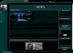
Well, as you can see, I did a little redesigning. All the little features like the poll now fit neatly in the little strip of shiznit to your right. Leave a comment and tell me what you think.

Now, I know that my little 'Vital Stats' box may start a flame war so have at it. I'm not any more happy that M$ has won the browser wars, but the fact is I've used just about every browser and in my honest opinion, IE is the best. People may claim that they break standards (me included), but I'm pretty sure I've tip-toed around IE specific features with this page so that should be transparent.

And as far as the resolution is concerned, if you're not in 1024x768 or higher, you're a fucking scrub, jack it up if you can. If you can't, buy a new video card/monitor and join the rest of civilization. I myself run in 1280x1024 and, even thought I've only been in this resolution for about a week, I can't imagine giving up all this screen real estate that I'm now used to.

On a side note, I changed the news archiving system a bit. Now instead of showing a specified number of days worth of posts on the main page and the rest in the archive, it now shows a specified number of posts on the main page and the rest in the archive. I did this incase something happened and I wasn't able to update for a while, and xerxes continued on updating with the frequency he has this past week, it wouldn't result in the main page having 2 or 3 posts on it due to the archive's date rules. Its set to display 8 posts now, tell me if you think it should display any more or less or if you would like me to impliment a cookie so you can decide how many posts are visible for each individual visitor.

And if you can think of another cool little feature to go in the side panel, be sure and drop a comment to suggest it.


Comments

NAME: glitch13
Wednesday, January 3rd, 2001 @ 03:48 pm
You still should feel guilty about that 8 year-old you molested and dumped in the river, tsk tsk.


NAME: glitch13
Tuesday, January 2nd, 2001 @ 11:58 am
you forgot to tell me to add BLINK tags around all text too.


NAME: ian the trogydae
Tuesday, January 2nd, 2001 @ 02:04 am
wow. i guess i don't have to feel so guilty about using ie now.


NAME: McGurk
Monday, January 1st, 2001 @ 02:33 am
here's what i think: switch the whole page to tables. put the menu on the left side underneath everything else. make the campic 2 degrees shorter, and move it to the other side of the main posts area. move the main posts area over to the left fililng the hole from the menu that used to reside there. put the random quote in the top space, and the topsite vote in the bottom space. parse the text out for the 800x600 users. have the poll pop up in a seperate window, cued by the interdependant menu system. maybe put some multi-layered reference structures. probably a better idea than that tho is to dereference your poll to a radio button, which can then be minimized. trust me, i've been coding pages since gopher. i even experimented with ftp pages, but it turned out to be more trouble than it was worth, and people kept crashing my site. if you have trouble understanding some of my more advanced techniques, i'd be happy to explain in more detail, just shoot me an e-mail.


NAME:
EMAIL: *OPTIONAL*
WEBSITE: *OPTIONAL*
WEBSITE: *OPTIONAL*
Comment:
    
|