|
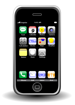
I bought an iPhone. I made a post about said iPhone. I created an svg of the iPhone for said post.
|

|
I'd have to say I'm rather proud of this one. I had to do a few hacky things to get that front part of the bun to simultaneously be in front and behind the weiner, but I'd say the finished product is pretty sharp.
|

|
N!nt3nd0 4 LiFe!
|

|
A handful of these icons were created because an original icon didn't exist, or it did but I wasn't happy with it. This is one of those. Actually I would have been just fine using the stock Steam icon, but I like to use Gnome's icon stretching to enlarge the icons of applications I use more often then others, and Steam's original bitmap icon looked quite assy when enlarged.
|

|
I drew a poop.
|

|
A wireless access point. Meh, it's ok.
|

|
Darwinia is an awesome game. If you haven't played it you have very little excuse seeming as it's available on pretty much everly platform that exists. It was made by Introversion, an indy game house, and they deserve your money for making awesome crossplatform indy games. Also, if you have the means, I highly recommend Uplink as well.
|

|
Created for a post about Mayor Ray Nagin's (New Orleans) horribly racist comment, "I don't care what people are saying Uptown or wherever they are. This city will be chocolate at the end of the day... This city will be a majority African-American city. It's the way God wants it to be."
|
|
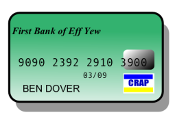
A credit card I whipped up for a post celebrating the day I cleared all my debt. Then a hurricane came and destroyed everything I knew and loved and now I'm in debt again. The End.
|
|
This is my all purpose icon for making posts about AJAX. It serves its purpose dutifully.
|

|
This is the UDCF (United Decepticon/Cobra Forces) insignia. Their alliance, and subsequent battles, are well documented here: The Great GI-Joe - Transformers War of 1988. And no, I did not design it, I just SVGerized it.
|

|
Larry the Cow, a "mascot" of sorts for Gentoo Linux. This is the first one I ever made, which is probably fairly obvious. While the line quality is crappy, one must keep in mind that that's pretty much the style the original was done in.
|

|
This is the Gentoo Linux logo. This is the second SVG graphic I've ever done and I'm rather proud of the fact that it was only my second endeavor and it's pretty much the most complicated one [Ed: was the most complicated]. I basically did this one to learn how to use gradients.
|

|
Once I had the basics down, I began this rolling with this "booze icon" theme. Don't really know why. Oh wait, I do. Because I totally love booze. This is probably my favorite one by far.
|

|
Continuation of the booze theme. I really dig this one too.
|

|
A little more complicated, and hard to pin down an "iconic" look for a beer bottle, but I'm rather proud of this one.
|

|
Was getting kind of burned out on the booze theme, this one's quality shows it.
|

|
I cranked this one out because John needed a logo for a post on his site about how he had donated to the EFF. I went ahead and did it beacuse it was pretty simple, geometrically speaking, although it looks like they've changed the logo's color scheme since then. I'm sure it's copyrighted by the Electronic Frontier Foundation or something, I'm not claiming I designed it.
|

|
If you visit my site (which you are doing right now) you'll probably recognize this image as the icon for the Peanut Gallery on the front page. Created explicitly for this purpose.
|

|
Back when I had the per-post comments disabled, I created this to be an icon place holder directly to each post. I ended up not liking the way it looked when shrunk down that far, so I just ditched it altogether.
|

|
This is what's pretty cool about doing this kind of stuff, I needed an image for a post on my site and I couldn't find one on the net that was really what I was going for so I just made one. Pretty good one too.
|

|
A scale. Same thing. Needed it. Made it.
|

|
A cigarette. Same thing. Needed it. Made it. Not too happy with the smoke, maybe I'll redo it.
|

|
I did this one for my archive section so I could divide it up by post topic.
|

|
This one I made for a post about Christmas shopping
|
'em. If you use 'em, gimme credit. If you change 'em, make the changes public. That is all.


